or FLYTE

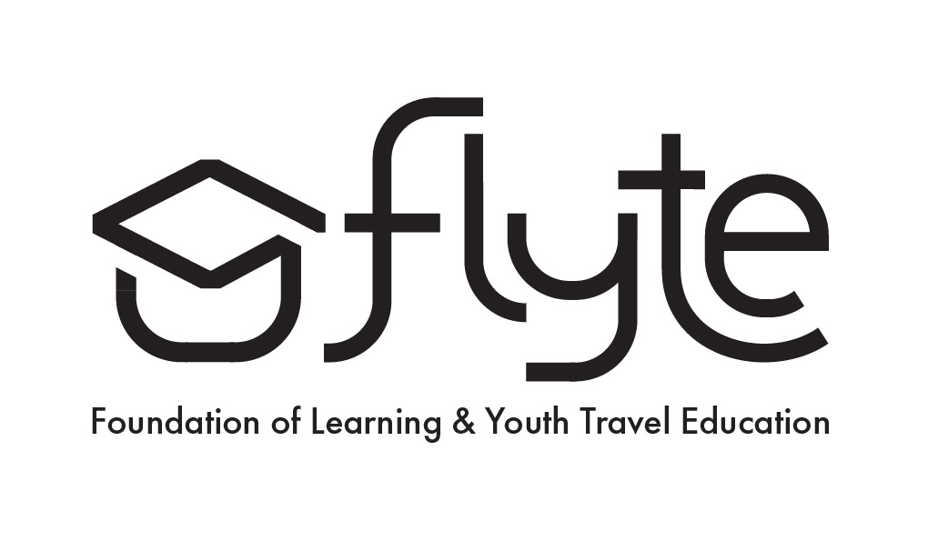
Old Logo

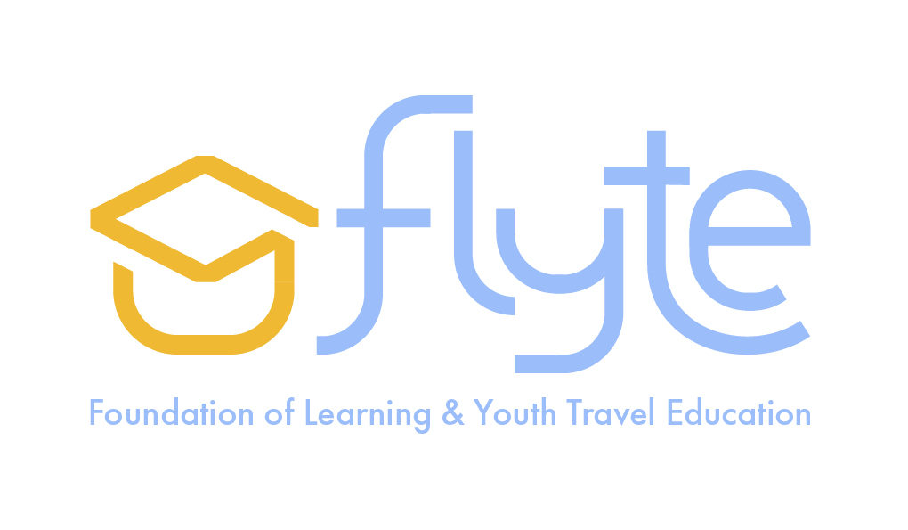
New Logo
Black-Colored Logo
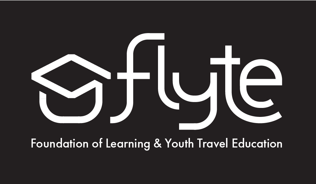
White-Colored Logo
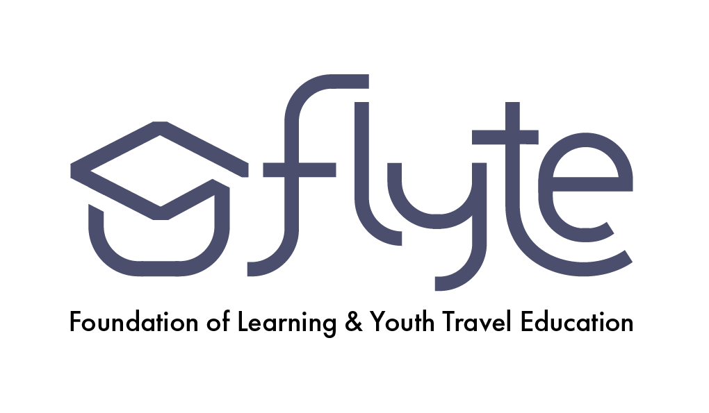
One-Color Colored Logo
Two-Color Colored Logo
Full Colored Logo
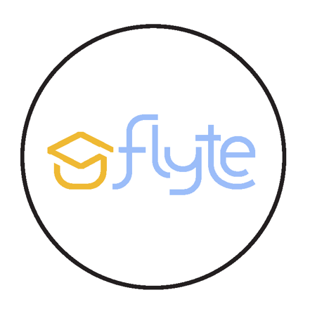
Logomark for Social Media
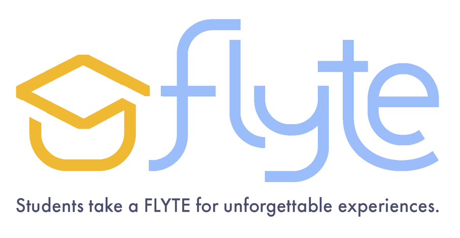
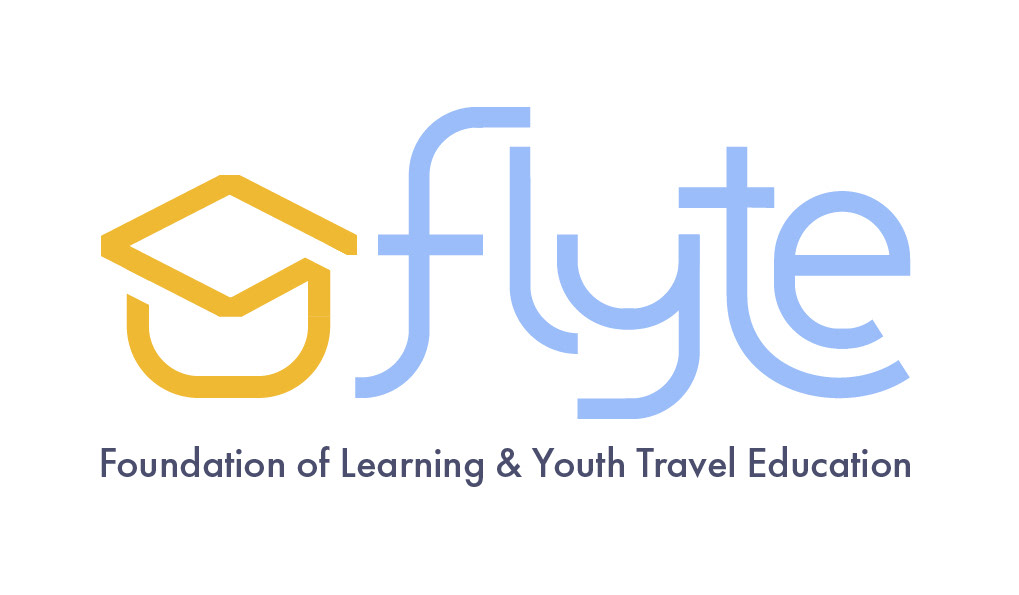
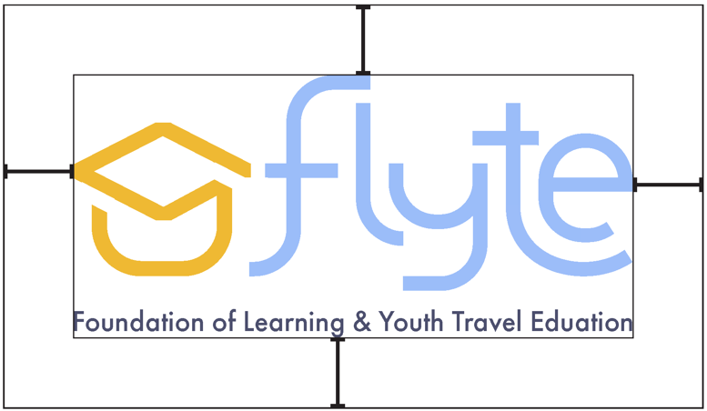
Logo with Tagline


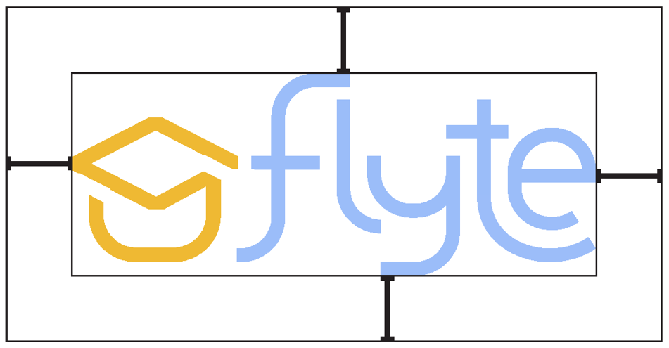
Primary Logo

Condensed Logo
The clear space is the horizontal length of the crossbar of "f" in flyte.
Primary Logo
Condensed Logo
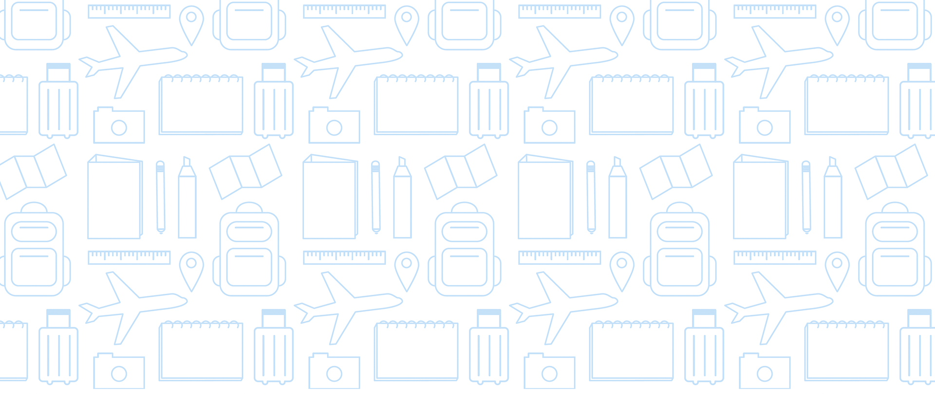
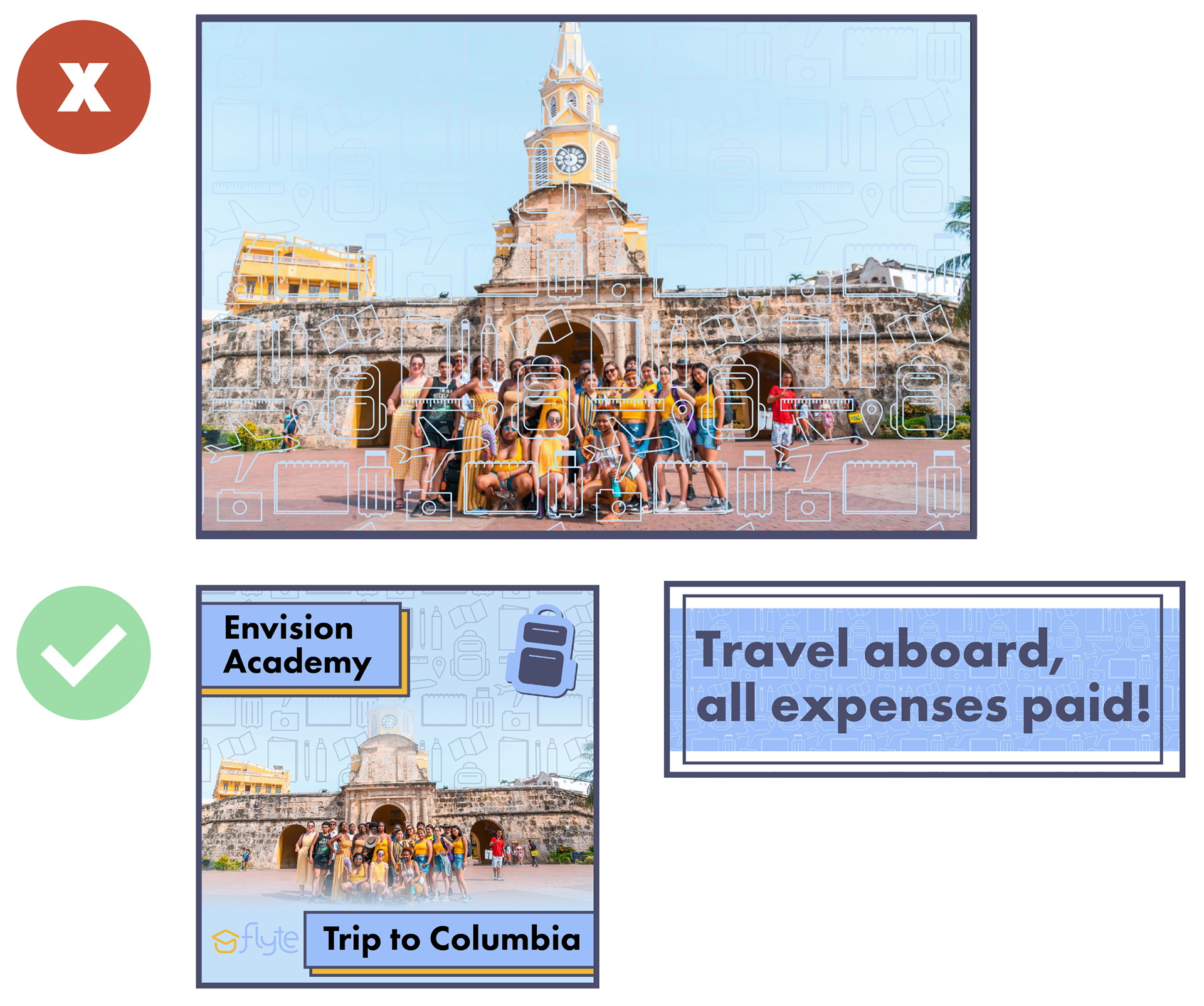
Pattern

Icons
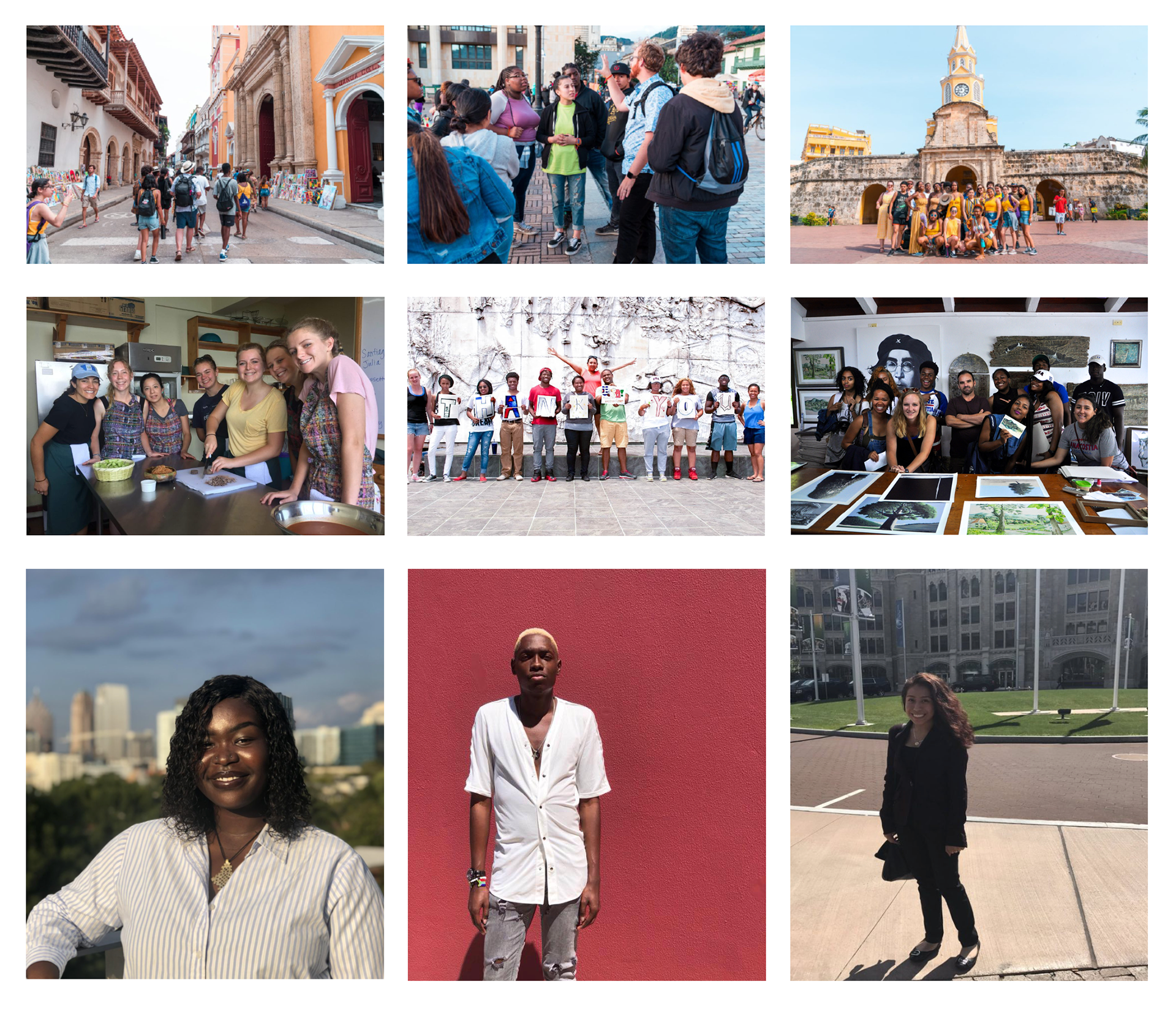
Example Images
Sizing: 11in x 14in
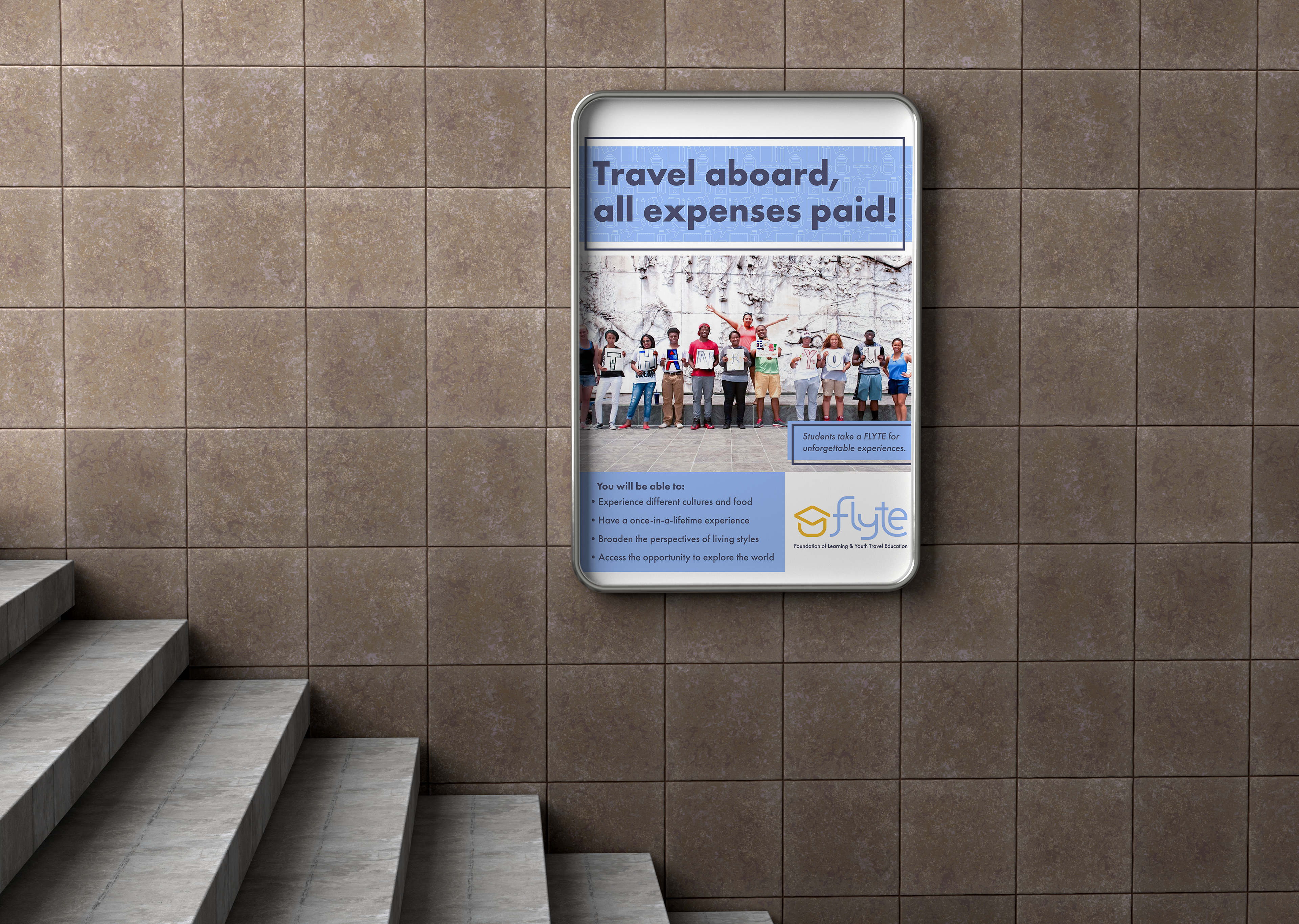
Outer Design
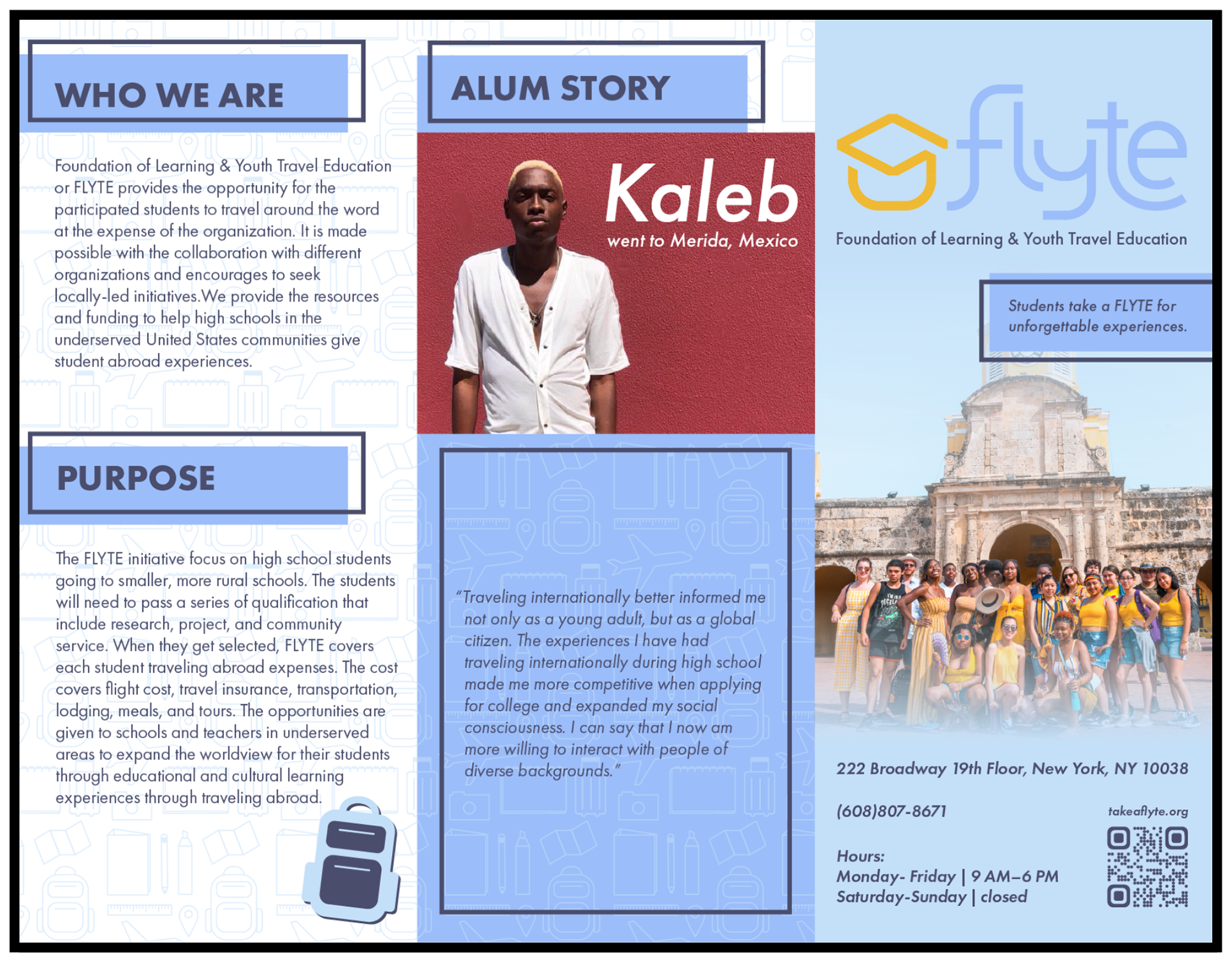
Sizing: 11in x 8.5
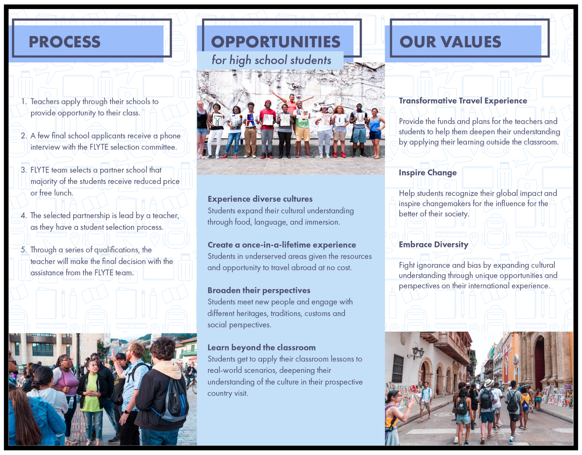
Inner Design
Sizing: 11in x 8.5in

Front Design
Sizing: 3.5n x 2in
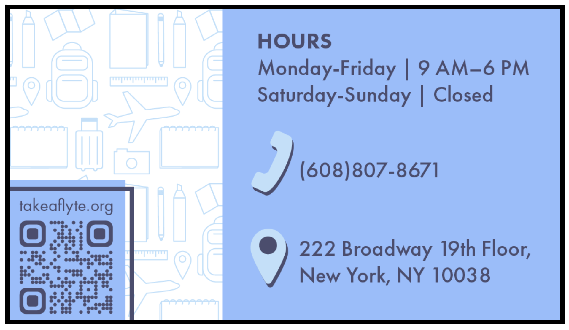
Back Design
Sizing: 3.5in x 2in
Business Letterhead
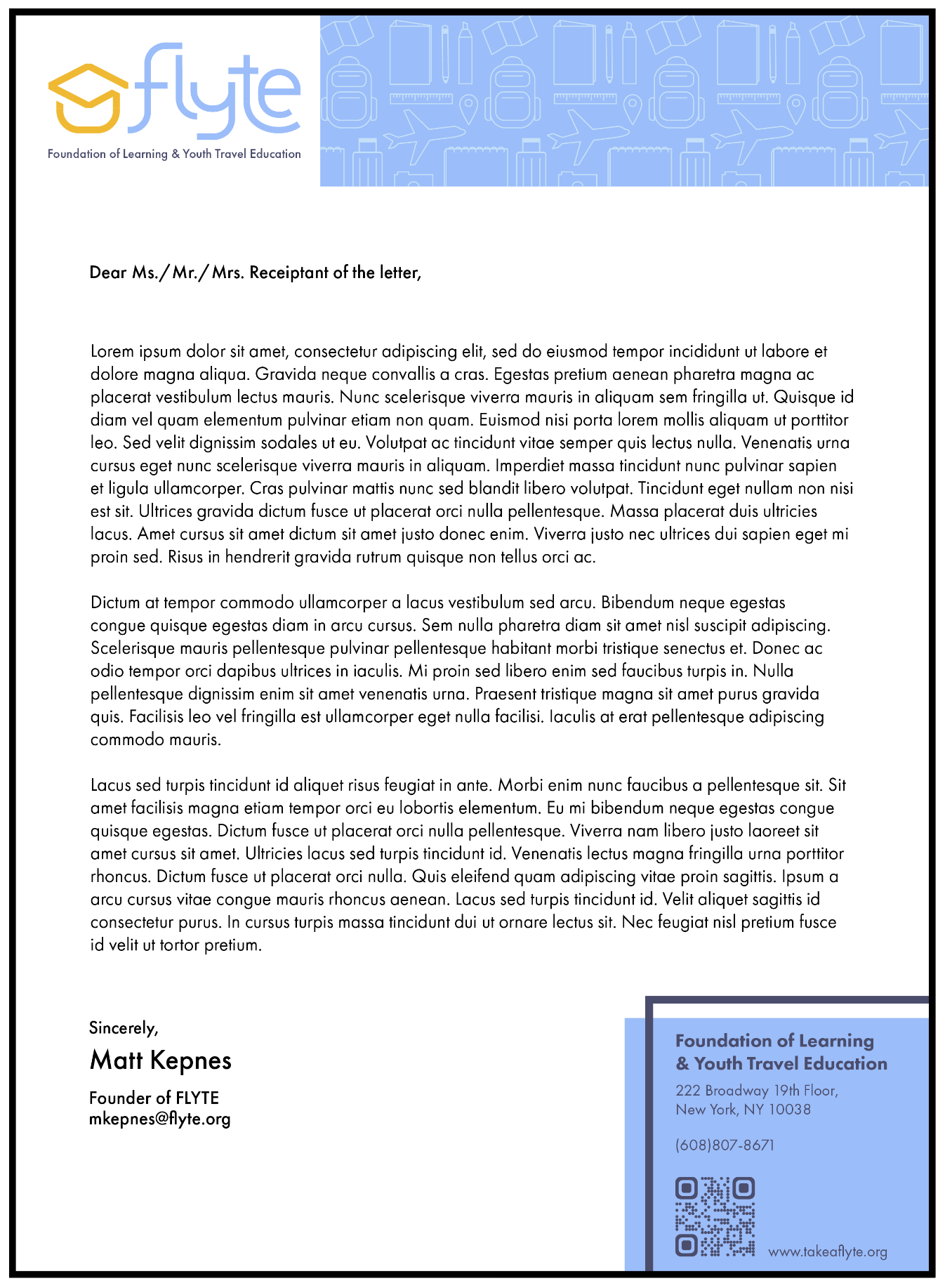
Sizing: 8.5in x 11in
Instagram
Sizing: 1080px x 1080px

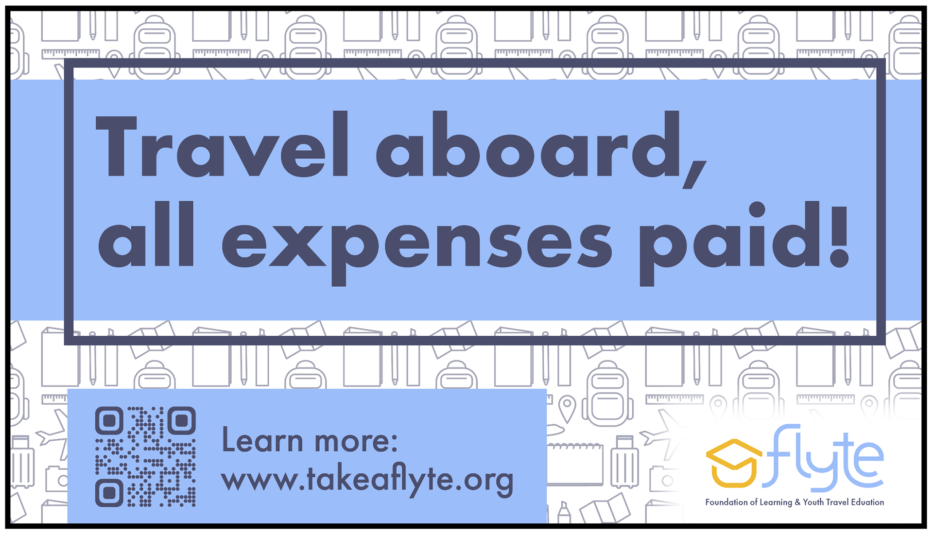
Facebook/Twitter/X
Sizing: 1980px x 1080px
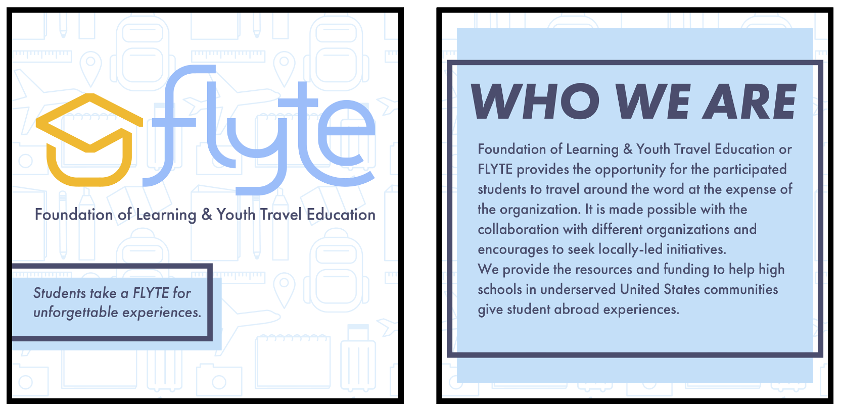
Instagram
Sizing: 1080px x 1080px
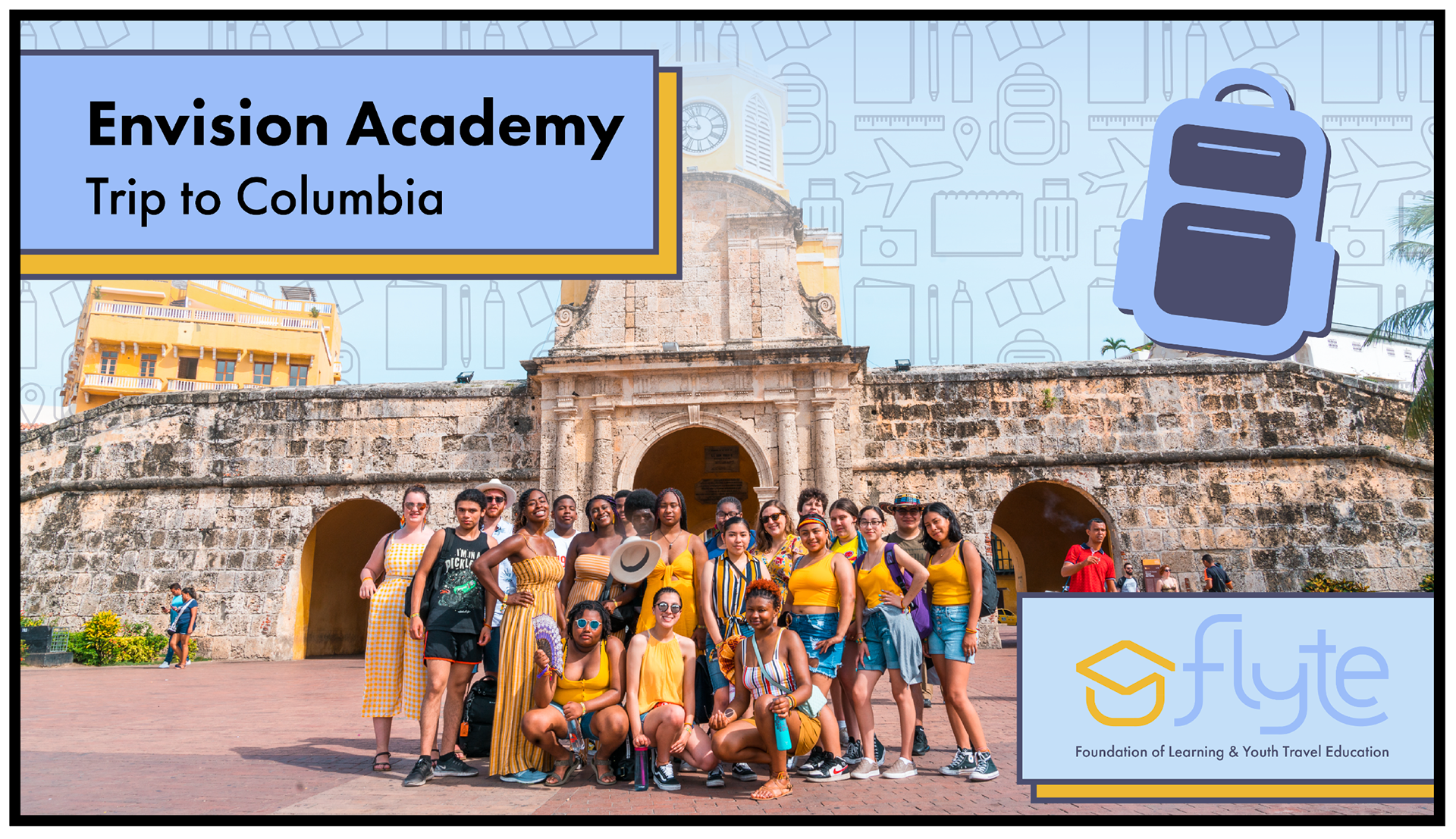
Facebook/Twitter/X
Sizing: 1980px x 1080px

Instagram
Sizing: 1080px x 1080px
Facebook/Twitter/X
Sizing: 1980px x 1080px
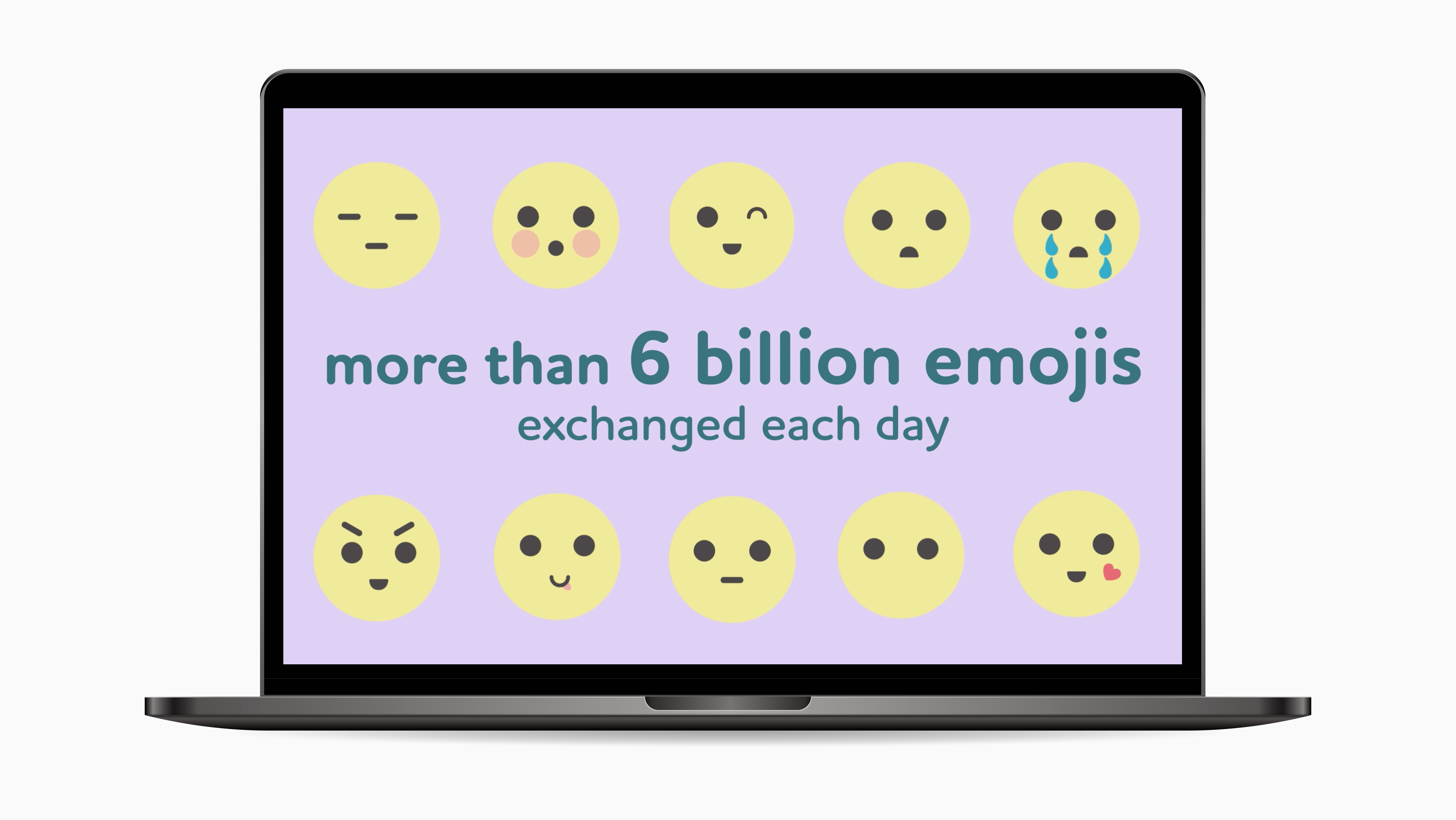
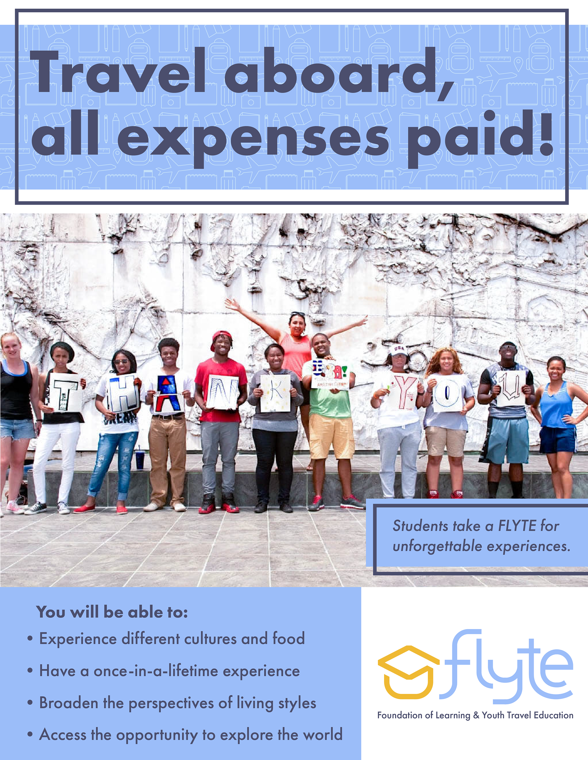
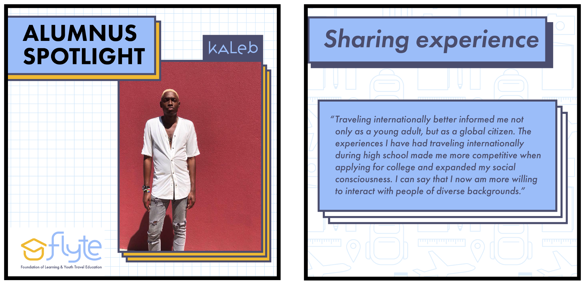
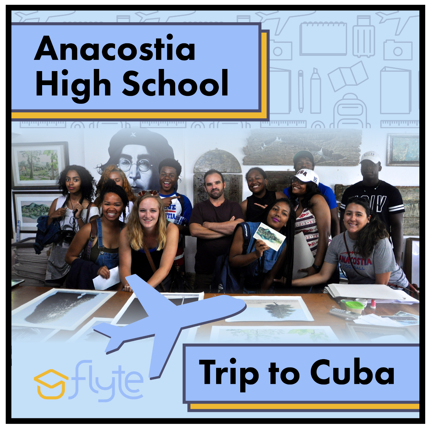
High School Feature

Instagram Post
Sizing: 1080px x 1080px
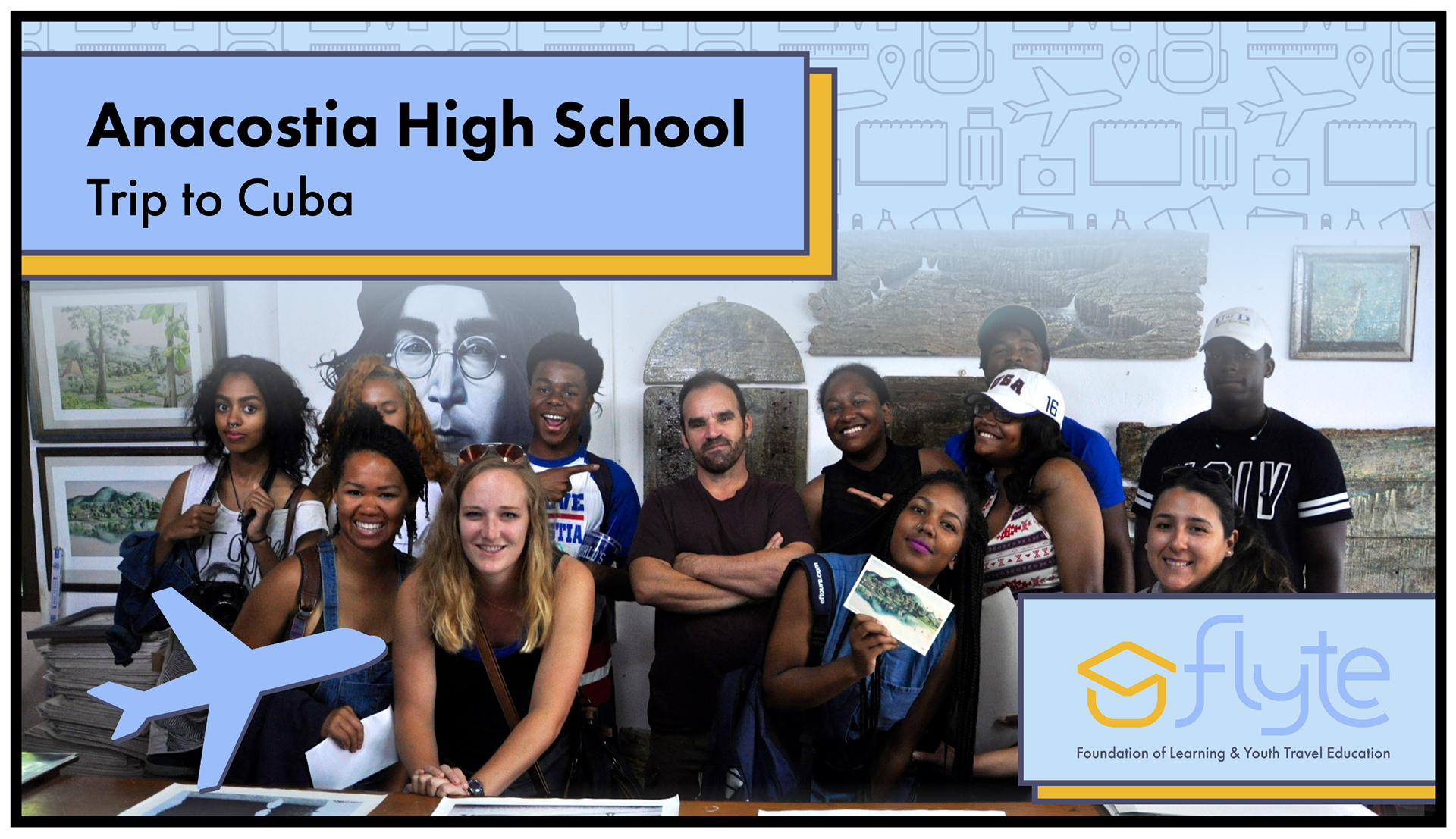
Facebook/Twitter/X
Sizing: 1980px x 1080px
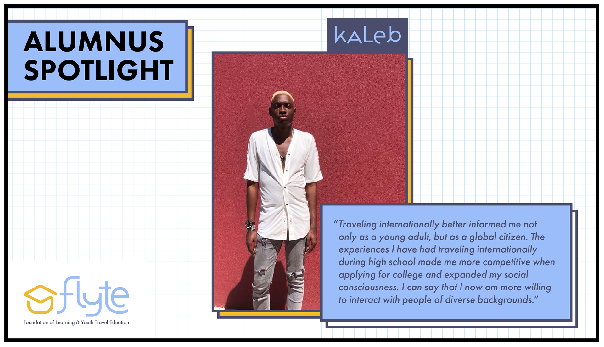
Instagram Post
Sizing: 1080px x 1080px
Facebook/Twitter/X
Sizing: 1980px x 1080px